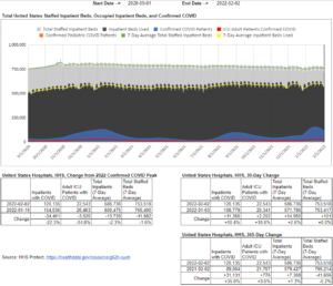
We’ve run versions of this chart before, but not since the national COVID hospital census peak on January 19. The yellow line – total inpatients – barely moved again this wave, a remarkable phenomenon the media has ignored throughout the pandemic, as they run with stories from hospital CEOs claiming to be overwhelmed and demanding more bailouts.
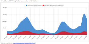
Zooming in on just the COVID utilization, we can see ICU census peaked nationally lower than last year despite substantially higher non-ICU census.
You can use our tool to see any state’s data presented in this same format here. (You’ll have to copy the file to enable state and date selection by going to File –> make a copy.)
https://docs.google.com/spreadsheets/d/15YbHKtjdHgS8kpZ7JUwluYLcVATvP95ypoGqUBdgcUo/edit?usp=sharing


